Your ads are working, but your hotel landing page isn’t. You launched the campaign, the clicks are coming in, and on paper everything looks like it’s working.
So why aren’t those clicks turning into bookings?
More often than not, the issue isn’t the ad, it’s what happens after the click. Instead of landing where they expect, potential guests are sent to a generic offers page, a booking engine with little context, or a homepage where the original offer gets lost entirely. In some cases, the page takes too long to load, slowed by oversized images or videos that interrupt the experience before it even begins.
What should feel like a seamless next step suddenly becomes a search, and when booking a hotel starts to feel like work, people don’t stick around. The reality is simple: the more steps, distractions, and decisions you add, the more likely you are to lose the booking. A clear, direct path not only reduces friction but speeds up decision-making and keeps momentum going.
Here’s where hotel landing pages tend to fall short and how to fix it.
1. Creating too many choices on your hotel’s offer page
A dedicated landing page is often the clearest path to conversion. But many hotel campaigns still send users to a broader offers page with multiple promotions competing for attention.
In some cases, a curated offers page can work well, especially when there are only a few relevant offers to compare. But when users are faced with too many options, the booking journey becomes less clear.
Now the user has to stop and think:
- Which one was it?
- Is this the right offer?
- Do I need to keep scrolling?
The more effort it takes to find what they originally clicked on, the more likely they are to leave altogether.
2. Sending users straight to your property’s booking engine
Some hotels skip the middle step entirely and send users straight to the booking engine.
At first glance, it makes sense. If someone clicked, they must be ready to book… right?
Not always.
Most users still need a moment to validate their decision. They want to quickly revisit what caught their attention in the first place, understand the offer, and feel confident they are making the right choice.
Instead, they land on a booking engine with:
- Dates and rates
- Little context about the offer
- No visuals or supporting information
Without that context, even high-intent users may hesitate. And hesitation is often all it takes to lose the booking.
3. Sending ads to your hotel homepage by default
When there is no clear landing page, the homepage often becomes the fallback.
It feels like a safe choice. It has everything, after all.
But that is exactly the problem.
Homepages are designed for exploration, not conversion. They contain competing messages, navigation paths, and calls to action. So when a user clicks on a specific offer and lands there instead, the path forward immediately becomes less clear.
Now they are navigating through:
- Dining pages
- Amenities
- Weddings and events
- Other unrelated content
Instead of moving toward a booking.
Rather than guiding users to the next step, the homepage asks them to start over. And most users will not take the time to do that.
So what does a better hotel landing page look like?
The common thread? Too many steps, too many decisions, and not enough clarity. The fix is not more options. It is a better path.
A strong hotel landing page should:
- Lead users directly to the offer they clicked on
- Reinforce the same offer and value presented in the ad
- Include a clear call to action that stands out immediately
- Prioritize mobile experience and fast load times
- Remove distractions that pull users away from booking
Examples of effective hotel landing pages
While every property is different, the most effective hotel landing pages share a common goal: keeping users focused on the offer and providing a clear path to booking.
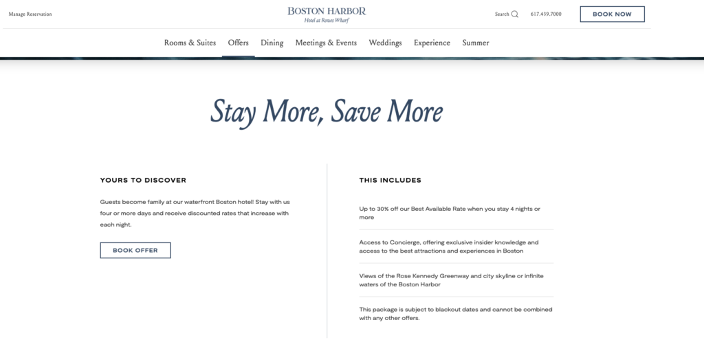
Boston Harbor Hotel’s “Stay More, Save More” offer page provides a clear value proposition, concise offer details, and a direct path to booking.
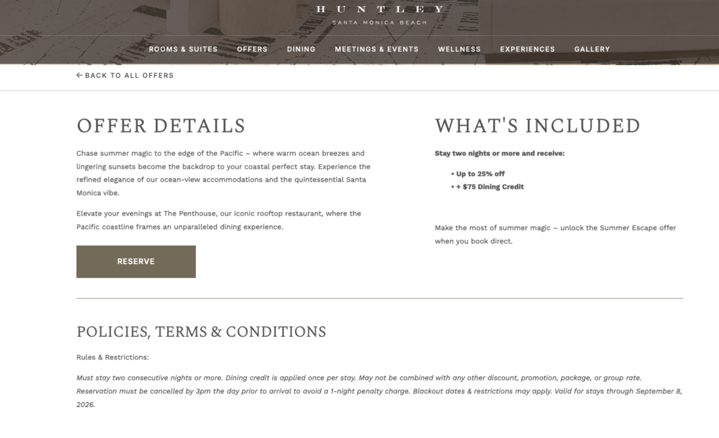
The Huntley Hotel’s “Summer Escape” offer page clearly outlines what’s included, helping guests quickly understand the value of the promotion before booking.
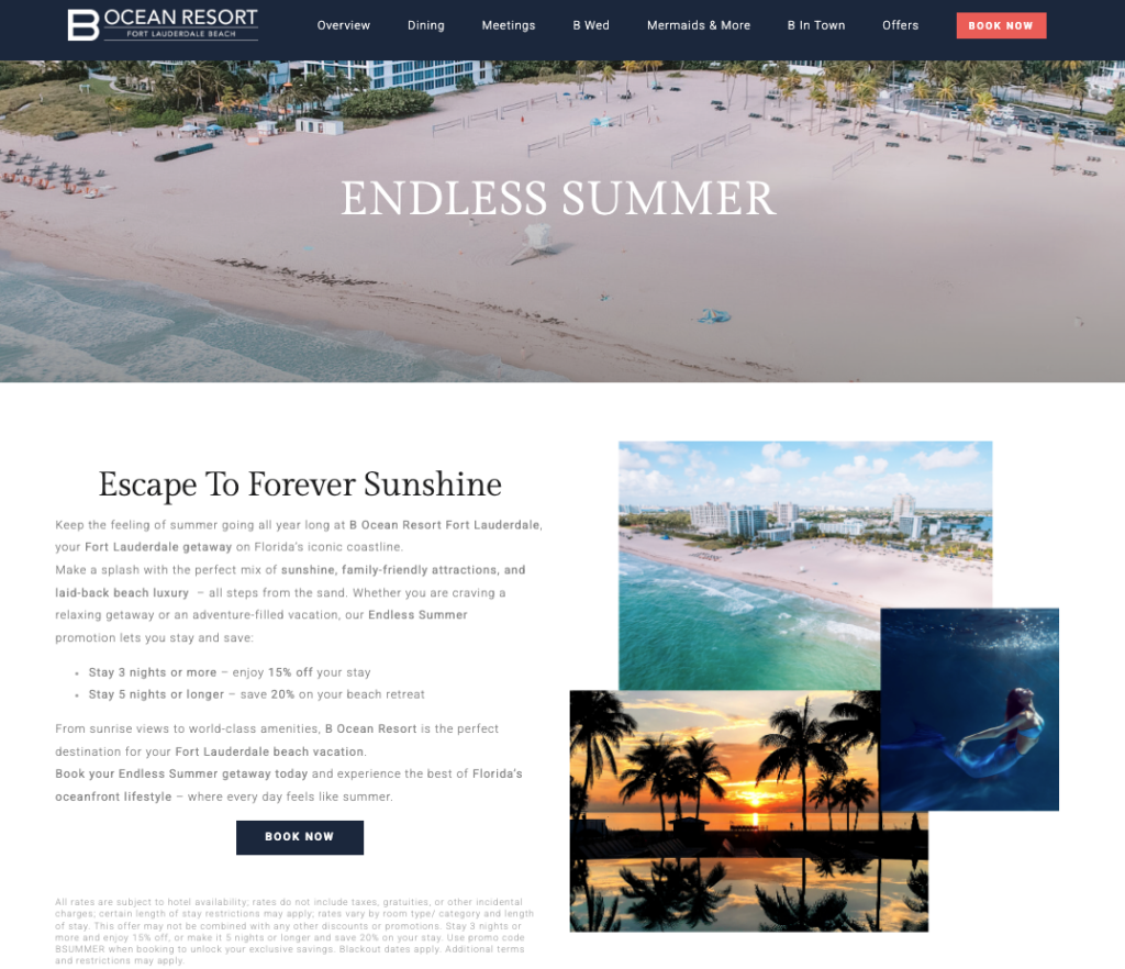
B Ocean Resort’s “Endless Summer” offer page combines compelling visuals with a focused promotional message, helping guests connect with the experience before taking the next step toward booking.
Sometimes simpler really is better. When users know exactly where they are and what to do next, they are far more likely to follow through.
At the end of the day, conversion is not about adding more. It is about removing friction.
Fewer clicks. Faster decisions. More bookings.
Not sure if your landing page experience is helping or hurting conversions? Reach out to GCommerce to identify opportunities to improve the booking journey and drive more bookings.
{
“@context”: “https://schema.org”,
“@type”: “FAQPage”,
“mainEntity”: [{
“@type”: “Question”,
“name”: “What is a hotel landing page?”,
“acceptedAnswer”: {
“@type”: “Answer”,
“text”: “
A hotel landing page is a dedicated webpage designed around a specific campaign, offer, or audience. Unlike a homepage or general offers page, it focuses on a single objective and guides users toward booking with minimal distractions.
”
}
}, {
“@type”: “Question”,
“name”: “Should hotel ads always lead to a dedicated landing page?”,
“acceptedAnswer”: {
“@type”: “Answer”,
“text”: “
Not always. A curated offers page can work well when there are only a few relevant promotions to compare. However, dedicated landing pages often provide a clearer path to conversion by keeping the focus on the offer that drove the click.
”
}
}, {
“@type”: “Question”,
“name”: “Why are users clicking my hotel ads but not booking?”,
“acceptedAnswer”: {
“@type”: “Answer”,
“text”: “
In many cases, the issue is not the ad itself. Users may encounter friction after the click, such as slow load times, too many choices, unclear calls to action, or a disconnect between the ad and the landing page experience.
”
}
}, {
“@type”: “Question”,
“name”: “What makes a high-converting hotel landing page?”,
“acceptedAnswer”: {
“@type”: “Answer”,
“text”: “
High-converting hotel landing pages typically feature a clear value proposition, a strong call to action, fast load times, mobile-friendly design, and a direct path to the offer or booking experience.
”
}
}]
}
Frequently asked questions about hotel landing pages
A hotel landing page is a dedicated webpage designed around a specific campaign, offer, or audience. Unlike a homepage or general offers page, it focuses on a single objective and guides users toward booking with minimal distractions.
Not always. A curated offers page can work well when there are only a few relevant promotions to compare. However, dedicated landing pages often provide a clearer path to conversion by keeping the focus on the offer that drove the click.
In many cases, the issue is not the ad itself. Users may encounter friction after the click, such as slow load times, too many choices, unclear calls to action, or a disconnect between the ad and the landing page experience.
High-converting hotel landing pages typically feature a clear value proposition, a strong call to action, fast load times, mobile-friendly design, and a direct path to the offer or booking experience.
The post 3 hotel landing page mistakes that cost your property bookings and how to fix them appeared first on GCommerce Solutions.